Ready To Grow? Let's Start...........
- (08) 6365 5364
- 216 Wanneroo Rd, Yokine WA 6060
- hello@automatecore.com.au


Ready To Grow? Let's Start...........
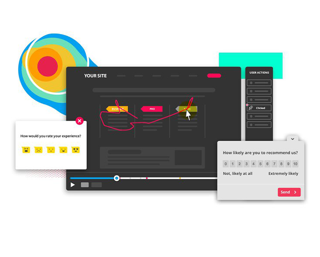
Heatmaps help you understand how people interact with your website pages, so you can find answers to business-critical questions such as ‘why are my users not converting?’ or ‘how do I get more visitors to take action?’ Using heatmaps, you can determine if people are:
As a visual tool, heat maps help you make informed, data-based decisions for A/B testing, updating, or (re)designing your website. And they are also useful on a wider business scale: heat maps let you show team members and stakeholders what’s happening and get their buy-in more easily when changes are needed—it’s hard to argue with a heat map!
Our software tells us how your audience is reacting to your online campaigns. By using heatmapping and eye tracking technology we follow the user’s journey from start to completion to ensure we have all bases covered.